There is a word for the flyer, the invitation, the menu, the poster and the infographic. Designers call it collateral, and people pay for it every day on Fiverr and in Canva because they assume it requires a skill they do not have. It does not. It requires a method, and the method is the part nobody explains.
The one sentence version is that you do not ask for collateral at all, you ask for its parts and then you stack them in order.
Why the one-prompt version always looks cheap
Ask any AI image tool for a Christmas party invitation with the date and the address on it, and something comes back that is almost right. The date is correct. The address is correct. It still looks like nothing you would send to anyone.
The reason is not the information, and this is where most people get stuck, because they keep adding detail to the prompt and keep getting the same disappointing result. The reason is that everything arrived fused into a single flat picture.
Image models paint letter shapes rather than typing them, so the words in that picture are not really words at all, they are drawings of words, which is exactly why they come back bent, misspelled and impossible to correct. There is no text layer to edit because there was never any text in the first place, only paint arranged to look like it.
And because the whole thing arrived as one fused image, changing a single line means generating all of it again and hoping the parts you liked happen to survive the second attempt.
What a designer actually does
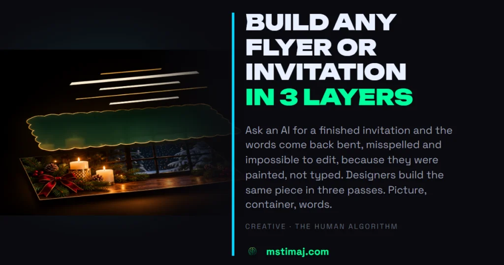
A designer builds the same artifact in three passes, and each pass produces something that remains editable afterwards.
- The picture. The scene, the texture and the light, generated with no words in it anywhere.
- The container. The shape that will hold the words, whether that is a panel, a card, an arch or a scalloped frame, placed on its own and still completely empty.
- The words. Set last and set by you, which is the only reason they come out straight and spelled correctly.
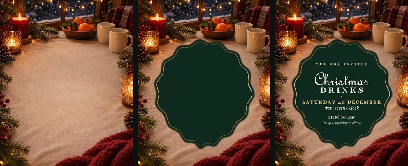
Layer two is the one almost everybody skips, and skipping it is the single clearest difference between something that looks designed and something that looks like text dumped onto a stock photo. The container is what gives the words contrast, a boundary, and somewhere to belong.
Layer one, and the sentence that matters most
Ask for the scene and nothing else, because the instruction doing the real work here is the one telling the model to leave the words out entirely, and it has to be explicit, since a model asked for an invitation will helpfully paint some lettering in without being told to.
A warm winter evening indoors, looking slightly down at a wooden table near a window. On the table: lit candles, pine sprigs, a bowl of clementines, two mugs. Through the window behind, soft snow falling in the dark. Deep greens, warm amber candlelight, a little cranberry red. Rich, cozy, photographic, shallow depth of field.
Do not write any words, letters or numbers anywhere in this image. Leave the center of the image calm and relatively empty, softly lit background only, because text is going on top of that area and it has to stay readable.
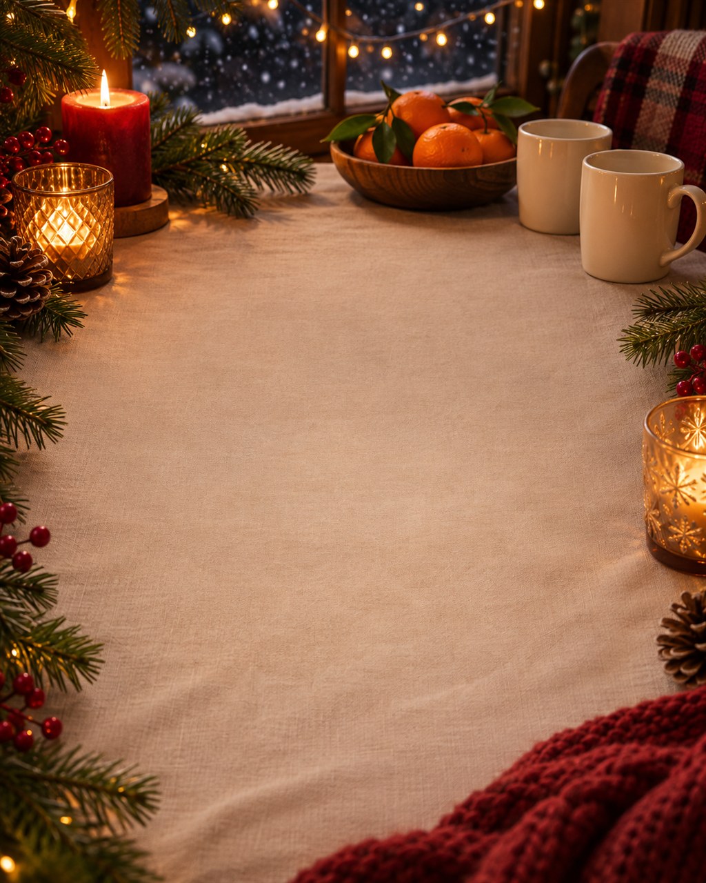
Two things in that prompt are doing more than they appear to. The first is the explicit ban on text. The second is reserving the middle of the frame, which means the interesting detail collects around the edges where it belongs and the center stays quiet enough to read across.
Layer two, the container
Now place a shape over that picture. It can be as simple as a rounded panel or as considered as an arch or a scalloped frame, and it should sit in the calm area you reserved. Give it a thin metallic edge if the piece calls for one.
You can generate this, but you do not have to, and usually you should not. A shape is the easiest thing in the world to place yourself, in anything from Canva to a few lines of code, and placing it yourself means you can move it later.
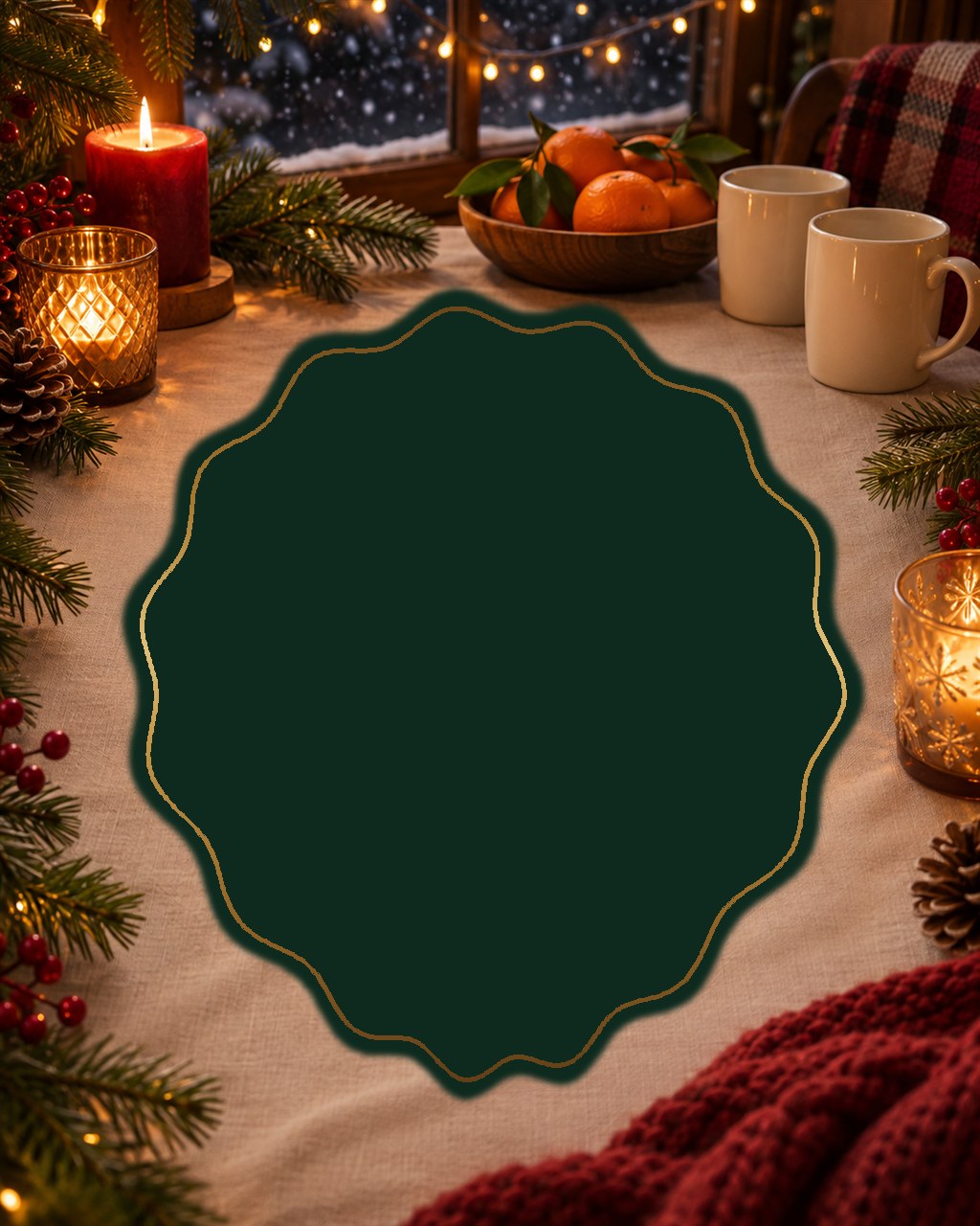
Look at the container before you add anything to it, because if the shape alone already looks deliberate then the words will land, and if it looks like a blob sitting on a photograph then no amount of good typography afterwards is going to rescue it.
Layer three, the words, and the part people rush
Set the words last and set them yourself, because that single decision is what makes them straight, correctly spelled and still changeable tomorrow.
Then give the information a hierarchy, because four lines at the same size is not a design, it is a paragraph. Every tier needs a different job, and the tiers should differ by more than size alone. Change the color and the case as well.
- What it is. The biggest thing on the piece by a wide margin, so there is no question what the reader is looking at.
- When it is. Second in weight and the only element carrying your accent color, because the date is the line a person actually has to act on.
- Where it is. Clearly smaller than the date, and plain enough that it does not compete with it.
- The ask. Bring a dish, reply by Friday, whatever it happens to be, and it should be the smallest and quietest thing there.
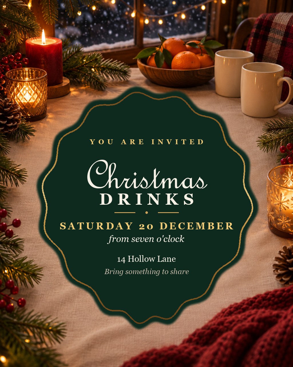
One more thing about the words, and it costs nothing to get right. Keep gradients off the type. A metallic gradient running through a small capital letter looks lovely on a screenshot and drops the contrast exactly where contrast matters most, which makes it harder to read for anyone whose vision is not perfect. Put the gradient on the decorative marks, the rules and the frame, and set the words themselves in one solid tone.
What you get for the extra effort
Three asks instead of one sounds like more work, and for the first version it genuinely is, by a couple of minutes at most.
The second version is where it pays. Because the piece is stacked rather than baked, changing the metal from gold to silver is one value. Changing the date is one line. Making a second invitation for a different night does not mean starting over and praying the model gives you the same table and the same candles, because the picture has not moved.
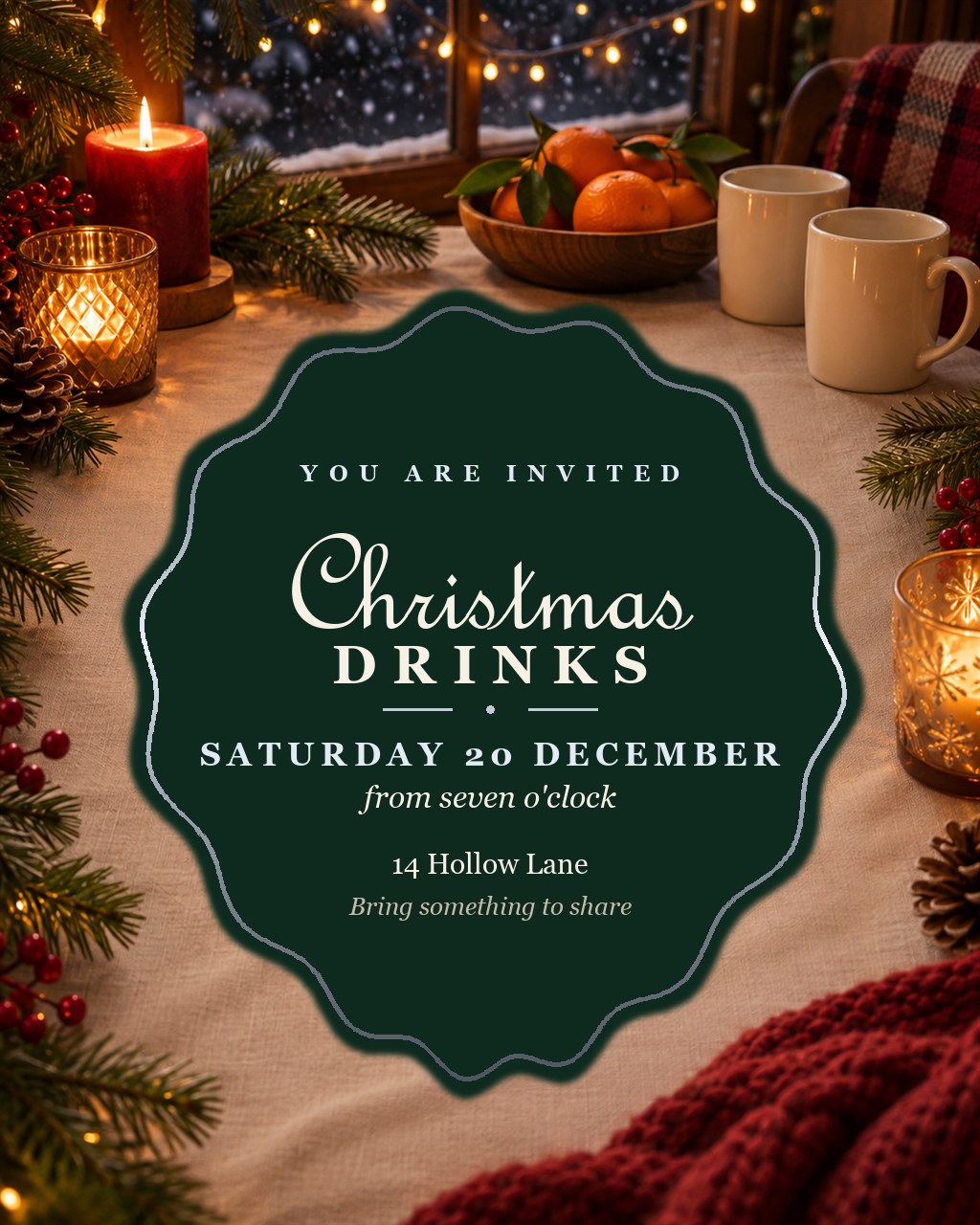
That is the real argument for working this way, and it is not that the first piece comes out better, although it does. It is that the tenth one costs you almost nothing.
The same three, every time
None of this is about invitations. Picture, container, words is how a flyer works, how a menu works, how a poster works, how an infographic works, how a book cover works. The artifact changes and the method does not.
So the next time you are about to type a prompt describing a finished thing, stop yourself at the first noun and ask for the picture instead. Then put a shape on it, and only then write on the shape.
And the short version, if you would rather not think about it
You do not actually have to run the three passes yourself. Knowing why they exist is the useful part, but the tools will do the separating for you if you simply tell them to, and most people never think to ask.
Build me a Christmas party invitation, but do it in separate components rather than one flat picture. Give me the background image on its own with no words in it, then the container or panel the words will sit in, then the text as its own layer. Give the information a clear visual hierarchy so the event name reads first, the date second, and the address and the small print after that.
That works in Claude, in ChatGPT, in Codex, in anything that can hold more than one step. The phrase carrying the weight is separate components rather than one flat picture, and the second half, visual hierarchy, is the one that stops you receiving four lines of identical text and calling it a design.
Ask for layers. That is genuinely the whole thing.
Forward → Upward ↑ Onward ↗
Mstimaj
Sources and Further Reading
- OpenAI, Codex CLI, the tool that generated every picture on this page: learn.chatgpt.com/docs/codex/cli
- OpenAI, Image generation, on asking a model for a scene and what happens when you ask it for lettering: developers.openai.com/api/docs/guides/image-generation
Say something back
Comments go through our own form and are read before they appear. Links are not allowed; describe it in words.